matrix#
- mqr.plot.correlation.matrix(data, ax, conf=0.95, fig=None, show_conf=False, cmap='RdBu', hist_kws=None, reg_kws=None, scatter_kws=None, line_kws=None, text_kws=None)#
Plot a correlation matrix and associated statistics.
Plots an n by n grid (where n is the number of columns in data). Each column and row corresponds to a column in the dataframe data. The lower diagonal shows scatter plots between the corresponding variables. The upper diagonal shows the statistics (1) Pearson correlation coefficient, (2) p-value for the correlation coefficient, and when show_conf is true, (3) confidence interval for the correlation coefficient.
Also:
- Whenever the p-value is less than the significance level (1-conf), the
values are printed in bold.
- When show_conf is true, the upper triangle is also coloured according to
the correlation coefficient. Positive correlations are shown in shades of blue while negative correlations are shown in shades of red. The saturation of the shade corresponds to the significance level of the correlation.
- Parameters:
- datapandas.DataFrame
Data with samples in columns. Calculate the correlations between columns.
- axmatplotlib.axes.Axes
Axes for the plot.
- conffloat, optional
Confidence level of the interval.
- figmatplotlib.figure.Figure, optional
The figure to which the axes belong. If not provided, the figure will be taken from the first axes.
- show_confbool, optional
Shows confidence intervals and colours when true.
- cmapstr, optional
Name of a colormap. Correlation coefficient is mapped to a colour in this colormap and shown in the upper triangle.
- hist_kwsdict, optional
Keyword args for the histogram. Passed to
seaborn.histplot.- reg_kwsdict, optional
Keyword args for the regression result. Passed as
**reg_kwstoseaborn.regplot.- scatter_kwsdict, optional
Keyword args for the scatter plot. Passed as
scatter_kws=scatter_kwstoseaborn.regplot.- line_kwsdict, optional
Keyword args for the line of best fit. Passed as
line_kws=line_kwstoseaborn.regplot.- text_kwsdict, optional
Keyword args for the text in the upper-right entries. Passed as
**text_kwstomatplotlib.pyplot.text.
Examples
Load sample data and show correlations, including confidence intervals.
data = pd.read_csv(mqr.sample_data('study-random-5x5.csv'))

fig, ax = plt.subplots(5, 5, figsize=(6, 6))
mqr.plot.correlation.matrix(
    data.loc[:, 'KPI1':'KPO2'],
    show_conf=True,
    ax=ax,
    fig=fig)
plt.show()
(
Source code,png,pdf)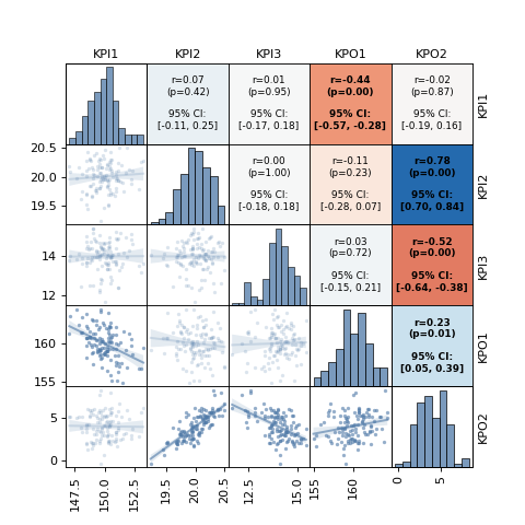