Regression and ANOVA#
- Related modules
- Detailed examples
MQR provides tools to analyse the results of ordinary least squares (OLS) and analysis of variance (ANOVA). The examples in this guide and example notebooks use statsmodels to compute the regressions.
The examples below use the formula API in statsmodels, which extracts data from a DataFrame by name. In all OLS and ANOVA cases below, the problem is eventually represented (internally, by statsmodels) as the matrix equation
where \(x\) is unknown and the problem is overdetermined (\(A\) is full-rank and has more rows than columns).
But, statsmodels also provides an interface to create models by passing the \(y\) and \(A\) directly;
see statsmodels.regression.linear_model.OLS.
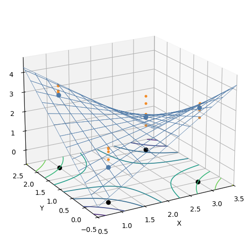
The following examples rely on this initial data, constructed like a \(2^2\) full-factorial experiment with 5 replicates.
np.random.seed(0)

data = np.vstack([
    np.tile([1, 3], 10),
    np.tile([0, 0, 2, 2], 5)]).T
levels = pd.DataFrame(data, columns=['X', 'Y'])

interact = levels.copy()
f_interact = lambda x, y: x + 2 * y - x * y
interact['Z'] = f_interact(interact['X'], interact['Y'])
interact['Z'] += st.norm(0, 0.5).rvs(len(levels))
That data looks like this, in 3D. The blue mesh is the actual function, the blue dots are the real values at each experimental configuration, and the orange dots are the samples from the function with added noise. The black dots mark the four corner points of the experiment, projected onto the bottom of the plot. The contours on the bottom plane are contour lines of the blue mesh.
Analysing residuals#
MQR automates plots that help to check the assumptions of OLS. They are
normal probability plot,
histogram with fitted normal PDF,
residuals versus observation order, and
residuals versus fitted value.
These plots can be shown together as a group by calling mqr.plot.regression.residuals.
Pass an array of four axes.
Below a 2-by-2 array is used.
model = statsmodels.formula.api.ols('Z ~ X + Y', interact)
result = model.fit()

with Figure(5, 4, 2, 2) as (fig, axs):
    mqr.plot.regression.residuals(result.resid, result.fittedvalues, axs=axs)
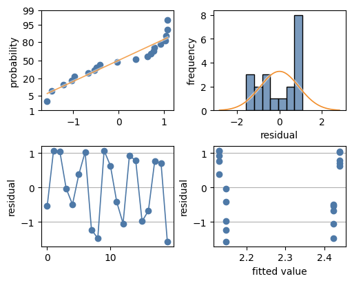
In this case the residuals don’t look at all normal/Gaussian:
the normal probability plot shows the data has a heavy right tail,
the histogram looks bi-modal and the heavy right tail is obvious,
the residual versus observation index seems to show high and low grouping, and
the residual versus fitted value shows at least two groups, a high group (first and last fitted value) and a low group (inner two fitted values).
This poor fit is the result of omitting the significant interaction term from the model.
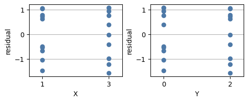
Plots for residual-versus-factor can be shown with:
with Figure(5, 2, 1, 2) as (fig, axs):
    mqr.plot.regression.res_v_factor(result.resid, interact['X'], axs[0])
    mqr.plot.regression.res_v_factor(result.resid, interact['Y'], axs[1])
Analysing categorical data#
In addition to these plots, seaborn’s catplot and the plots used to construct it are excellent for visualising categorical data.
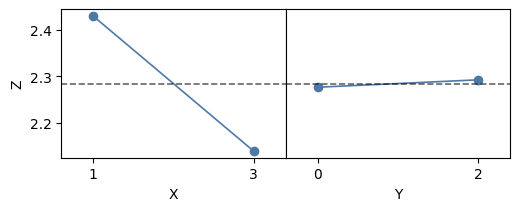
Main effects#
To show main effects, use mqr.plot.anova.main_effects.
with Figure(5, 2, 1, 2) as (fig, axs):
    mqr.plot.tools.sharey(fig, axs)
    mqr.plot.anova.main_effects(
        interact,
        response='Z',
        factors=['X', 'Y'],
        axs=axs)
Interactions#
Use mqr.anova.interactions to produce an interaction table,
and use mqr.plot.anova.interactions to show interaction plots.
This example shows an interaction table between ‘X’ and ‘Y’,
and also a plot for the same interaction.
When there are more factors, the interactions table will average over the other factors,
whereas the interaction plot can plot each factor on a new axis, showing each factor’s
interaction with the group factor (‘Y’ in this case).
interaction_table = mqr.anova.interactions(interact, value='Z', between=['X', 'Y'])
with Figure(3, 2) as (fig, axs):
    mqr.plot.anova.interactions(
        interact,
        response='Z',
        group='Y',
        factors=['X'],
        axs=axs)
    plot = grab_figure(fig)

hstack(interaction_table, plot)
| Y | 0 | 2 |
|---|---|---|
| X | ||
| 1 | 1.5784 | 3.2830 |
| 3 | 2.9750 | 1.3023 |

Including the interaction in the model gives the following result. The model components are now significant, (though the main effects should be treated with care since it might not be clear in practise how much of the main effect is actually interaction). The residuals now look normally distributed, there is no obvious pattern in the residual-versus-observation plot, and the residual-versus-fitted-value plot shows group residuals distributed around their means of zero.
model = statsmodels.formula.api.ols('Z ~ X * Y', interact)
result = model.fit()

with Figure(5, 4, 2, 2) as (fig, axs):
    mqr.plot.regression.residuals(result.resid, result.fittedvalues, axs)
    plot = grab_figure(fig)

vstack(
    mqr.anova.summary(result),
    plot
)
| df | sum_sq | mean_sq | F | PR(>F) | |
|---|---|---|---|---|---|
| X | 1 | 0.4263 | 0.4263 | 2.52 | 0.132 |
| Y | 1 | 0.001277 | 0.001277 | 0.01 | 0.932 |
| X:Y | 1 | 14.26 | 14.26 | 84.43 | 0.000 |
| Residual | 16 | 2.702 | 0.1689 | nan | nan |
| Total | 19 | 17.39 | 0.9151 | nan | nan |

Model means#
The means of experimental levels (eg. the mean at each corner point in a full-factorial experiment)
can be shown in a table with mqr.anova.groups, and
can be plot with confidence intervals using mqr.plot.anova.model_means.
The confidence intervals are constructed from the variance estimate that ANOVA makes from the regression error space.
The routine calculates averages over the factors that are not listed.
groups_x = mqr.anova.groups(result, value='Z', factor='X')
groups_y = mqr.anova.groups(result, value='Z', factor='Y')

with Figure(5, 2, 1, 2) as (fig, axs):
    mqr.plot.tools.sharey(fig, axs)
    mqr.plot.anova.model_means(result, response='Z', factors=['X', 'Y'], axs=axs)
    plot = grab_figure(fig)

vstack(
    hstack(groups_x, mqr.nbtools.Line.VERTICAL, groups_y),
    plot
)
| count | mean | lower | upper | |
|---|---|---|---|---|
| X | ||||
| 1 | 10 | 2.431 | 2.155 | 2.706 |
| 3 | 10 | 2.139 | 1.863 | 2.414 |
| count | mean | lower | upper | |
|---|---|---|---|---|
| Y | ||||
| 0 | 10 | 2.277 | 2.001 | 2.552 |
| 2 | 10 | 2.293 | 2.017 | 2.568 |

ANOVA/regression tables#
MQR collects statistics about the fitted model into three tables.
The
mqr.anova.adequacytable shows statistics on how well the model fits the data. R-squared and adjusted r-squared values are in this table.The
mqr.anova.summarytable shows statistics related to the model components (contrasts). F-statistics and p-values for the group means and interactions are in this table.The
mqr.anova.coeffstable shows the coefficients of the terms in the model. t-statistics and p-values for the coefficients, and the variance inflation factor are all shown in this table.
vstack(
    '### Adequacy',
    mqr.anova.adequacy(result),
    mqr.nbtools.Line.HORIZONTAL,
    '### Summary',
    mqr.anova.summary(result),
    mqr.nbtools.Line.HORIZONTAL,
    '### Coefficients',
    mqr.anova.coeffs(result)
)
Adequacy
| S | R-sq | R-sq (adj) | F | PR(>F) | AIC | BIC | N | |
|---|---|---|---|---|---|---|---|---|
| 0.4109 | 0.8446 | 0.8155 | 28.99 | 0.000 | 24.72 | 28.7 | 20 |
Summary
| df | sum_sq | mean_sq | F | PR(>F) | |
|---|---|---|---|---|---|
| X | 1 | 0.4263 | 0.4263 | 2.52 | 0.132 |
| Y | 1 | 0.001277 | 0.001277 | 0.01 | 0.932 |
| X:Y | 1 | 14.26 | 14.26 | 84.43 | 0.000 |
| Residual | 16 | 2.702 | 0.1689 | nan | nan |
| Total | 19 | 17.39 | 0.9151 | nan | nan |
Coefficients
| Coeff | lower | upper | t | PR(>|t|) | VIF | |
|---|---|---|---|---|---|---|
| Intercept | 0.88 | 0.264 | 1.496 | 3.03 | 0.008 | 10 |
| X | 0.6983 | 0.4229 | 0.9738 | 5.37 | 0.000 | 2 |
| Y | 1.697 | 1.261 | 2.132 | 8.26 | 0.000 | 5 |
| X:Y | -0.8443 | -1.039 | -0.6495 | -9.19 | 0.000 | 6 |
The summary table shows the interaction is significant, as expected.
The main effects should be analysed separately now to determine
how much effect was due to the interaction.
The group means should also be reviewed.