Process Summary and Capability#
- Related modules
mqr.plot.ishikawa
mqr.process(andmqr.plot.process)
mqr.plot.correlation- Detailed examples
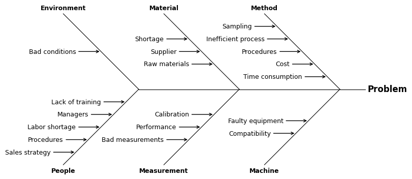
Fishbone diagram#
A fishbone diagram can be constructed with the tools in matplotlib, though constructing all the lines by hand is a bit tedious, so MQR includes a convenience function to create the plot.
The plot can create only two levels of “bones”, including the “spine”.
The top-level result is given in the argument problem
and the two levels of causes are given in the argument causes.
This is a general diagram.
problem = 'Problem'
causes = {
    'Method': ['Time consumption', 'Cost', 'Procedures', 'Inefficient process', 'Sampling'],
    'Machine': ['Faulty equipment', 'Compatibility'],
    'Material': ['Raw materials', 'Supplier', 'Shortage'],
    'Measurement': ['Calibration', 'Performance', 'Bad measurements'],
    'Environment': ['Bad conditions'],
    'People': ['Lack of training', 'Managers', 'Labor shortage', 'Procedures', 'Sales strategy'],
}

with Figure(8, 5) as (fig, ax):
    mqr.plot.ishikawa(problem, causes, ax=ax)
A more specific example for, say, the variability in the yield strength in a dimension of an injection molded plastic part might be like this.
problem = '$\\mathbf{var}\\ \\sigma_y$'
causes = {
    'method': [
        'gate location', 'shear rate', 'hold pressure',
        'hold time', 'gate-wall ratio', 'location in batch mould'],
    'machine': [
        'time since service', 'time since sensor calibration',
        'warm-up time', 'mold surface texture'],
    'material': ['pellet material', 'colour (dye)', 'supplier'],
    'measurement': ['gauge capability', 'gauge calibration'],
    'environment': ['humidity at pellet hopper', 'ambient temp (cooling time)'],
    'people': ['removal technique', 'removal force'],
}

with Figure(8, 5) as (fig, ax):
    mqr.plot.ishikawa(problem, causes, ax=ax)
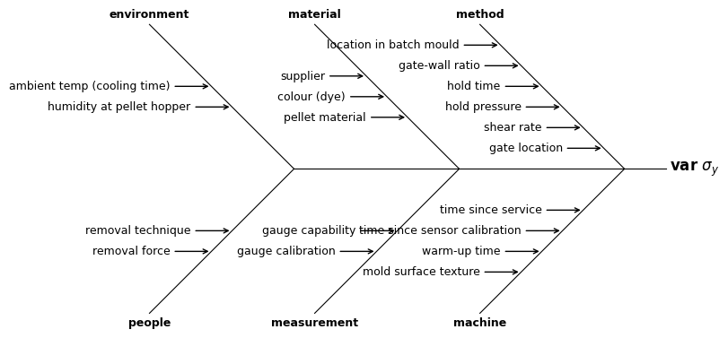
Often the defaults and matplotlib’s spacing algorithms will present a tidy diagram. The Ishikawa defaults in MQR can be viewed at
mqr.plot.defaults.Defaults.ishikawa
{'head_space': 2.0,
 'bone_space': 8.0,
 'bone_angle': 0.7853981633974483,
 'cause_space': 1.0,
 'cause_length': 2.0,
 'padding': (1.0, 1.0, 1.0, 1.0),
 'line_kwargs': {'linewidth': 0.8, 'color': 'k'},
 'defect_font_dict': {'fontsize': 12, 'weight': 'bold'},
 'cause_font_dict': {'fontsize': 9, 'weight': 'bold'},
 'primary_font_dict': {'fontsize': 9},
 'bone_rise': 7.0,
 'bone_run': np.float64(7.000000000000001)}
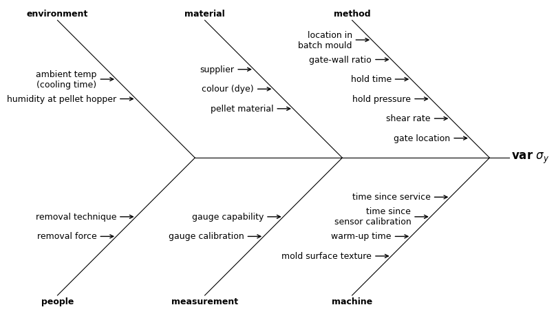
For this diagram, split the long lines and increase the bone-space and cause-space. To split a line, insert a new-line character “\n” (backslash-n).
causes = {
    'method': [
        'gate location', 'shear rate', 'hold pressure',
        'hold time', 'gate-wall ratio', 'location in\nbatch mould'],
    'machine': [
        'time since service', 'time since\nsensor calibration',
        'warm-up time', 'mold surface texture'],
    'material': ['pellet material', 'colour (dye)', 'supplier'],
    'measurement': ['gauge capability', 'gauge calibration'],
    'environment': ['humidity at pellet hopper', 'ambient temp\n(cooling time)'],
    'people': ['removal technique', 'removal force'],
}

ishikawa_kws = {'bone_space': 15.0, 'cause_space': 2.0}

with Figure(8, 5) as (fig, ax):
    mqr.plot.ishikawa(problem, causes, ax, ishikawa_kws)
Summary statistics#
Summary statistics are organised into the following types.
mqr.process.SummaryA set of samples from a process, optionally including specifications for the dimensions which are used to calculate capability.
mqr.process.SpecificationA target, and lower and upper limits.
mqr.process.SampleMeasurements from a single dimension in a process/product shown with a set of common descriptive statistics.
mqr.process.CapabilityFormed from a sample and a specification, contains process potential, capability, and expected defect rates.
Summary#
Of those types, Summary and Specification
must be constructed manually.
The other two are created automatically when Summary is created with Specifications.
Create a summary of a process from a DataFrame.
data = pd.read_csv(mqr.sample_data('study-random-5x5.csv'))
data.head()
| run | part | operator | replicate | KPI1 | KPI2 | KPI3 | KPO1 | KPO2 | |
|---|---|---|---|---|---|---|---|---|---|
| 0 | 0 | A1 | Op A | 1 | 152.234 | 19.952 | 15.190 | 159.717 | 2.619 |
| 1 | 1 | A1 | Op A | 2 | 149.571 | 19.914 | 15.101 | 159.380 | 2.116 |
| 2 | 2 | A1 | Op A | 3 | 150.542 | 19.735 | 12.951 | 162.806 | 4.656 |
| 3 | 3 | A1 | Op B | 1 | 148.946 | 19.661 | 13.979 | 159.633 | 2.031 |
| 4 | 4 | A1 | Op B | 2 | 148.948 | 20.171 | 13.784 | 163.127 | 5.880 |
Pass the measurements from the DataFrame to the mqr.process.Summary constructor.
summary = mqr.process.Summary(data.loc[:, 'KPI1':'KPO2'])
summary
| KPI1 | KPI2 | KPI3 | KPO1 | KPO2 | |
|---|---|---|---|---|---|
| Normality (Anderson-Darling) | |||||
| Stat | 0.34262 | 0.23807 | 1.1871 | 0.19191 | 0.70216 |
| P-value | 0.48587 | 0.77799 | 0.0040861 | 0.89435 | 0.065132 |
| N | 120 | 120 | 120 | 120 | 120 |
| Mean | 149.97 | 20.003 | 14.004 | 160.05 | 4.0189 |
| StdDev | 1.1733 | 0.24530 | 0.75645 | 2.0489 | 1.5634 |
| Variance | 1.3767 | 0.060174 | 0.57221 | 4.1979 | 2.4442 |
| Skewness | 0.23671 | -0.31725 | -0.63426 | -0.12055 | 0.087372 |
| Kurtosis | 0.34013 | -0.032887 | 0.37921 | -0.16922 | -0.18837 |
| Minimum | 147.03 | 19.234 | 11.639 | 154.89 | -0.37200 |
| 1st Quartile | 149.22 | 19.833 | 13.642 | 158.87 | 2.9020 |
| Median | 149.97 | 20.011 | 14.033 | 160.03 | 3.9265 |
| 3rd Quartile | 150.56 | 20.174 | 14.481 | 161.35 | 5.2163 |
| Maximum | 153.27 | 20.505 | 15.460 | 164.51 | 8.2830 |
| N Outliers | 5 | 1 | 4 | 1 | 0 |
Samples are automatically created as part of a Summary,
and can be retrieved using indexing syntax.
vstack(
    f'median = {summary['KPO1'].median}',
    summary['KPI2'],
)
median = 160.025
| KPI2 | |
|---|---|
| Normality (Anderson-Darling) | |
| Stat | 0.23807 |
| P-value | 0.77799 |
| N | 120 |
| Mean | 20.003 |
| StdDev | 0.24530 |
| Variance | 0.060174 |
| Skewness | -0.31725 |
| Kurtosis | -0.032887 |
| Minimum | 19.234 |
| 1st Quartile | 19.833 |
| Median | 20.011 |
| 3rd Quartile | 20.174 |
| Maximum | 20.505 |
| N Outliers | 1 |
Specifications and capability#
If specifications (mqr.process.Specification) are passed to Summary
then capabilities will be included in the summary.
They are stored in the Summary.capabilities attribute.
specs = {
    'KPI1': mqr.process.Specification(150, 145, 155),       # cp=cpk~1.33
    'KPI2': mqr.process.Specification(20.25, 19.00, 21.50), # cp~1.67, cpk~1.33
    'KPI3': mqr.process.Specification(14.00, 11.72, 16.28), # cp=cpk~1.00
    'KPO1': mqr.process.Specification(160, 148, 172),       # cp=cpk~2.00
    'KPO2': mqr.process.Specification(2, -7.6, 11.6),       # cp~2.00, cpk~1.67
}

summary = mqr.process.Summary(data.loc[:, 'KPI1':'KPO2'], specs)
summary.capabilities
| KPI1 | KPI2 | KPI3 | KPO1 | KPO2 | |
|---|---|---|---|---|---|
| USL | 155. | 21.5 | 16.3 | 172. | 11.6 | Target | 150. | 20.2 | 14.0 | 160. | 2.00 |
| LSL | 145. | 19.0 | 11.7 | 148. | -7.60 |
| Cpk | 1.41 | 1.36 | 1.00 | 1.94 | 1.62 |
| Cp | 1.42 | 1.70 | 1.00 | 1.95 | 2.05 |
| Defectsst (ppm) | 20.4 | 21.8 | 2.58e+03 | 0.00476 | 0.620 |
| Defectslt (ppm) | 123. | 97.8 | 2.62e+03 | 0.939 | 11.5 |
Graphical summaries#
These routines (from mqr.plot.process) operate on the types from mqr.process.
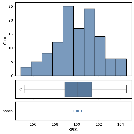
The histogram and box plot for a sample and also a confidence interval for its mean can be shown on a plot with
with Figure(5, 5, 3, 1, height_ratios=(4, 1, 1)) as (fig, axs):
    mqr.plot.process.summary(summary['KPO1'], axs)
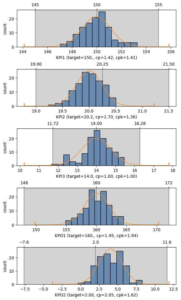
If a summary was created with specifications, MQR can show sample capabilities graphically.
If the target capability is different from 2.0 (the default), pass the target as cp,
which truncates the tails of the fitted density function so that if it fits in the tolerance region,
then the sample has at least the specified capability.
with Figure(6, 10, 5) as (fig, axs):
    for ax, name in zip(axs, ['KPI1', 'KPI2', 'KPI3', 'KPO1', 'KPO2']):
        mqr.plot.process.capability(summary, name, cp=5/3, ax=ax)
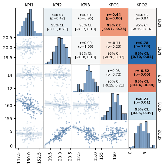
Correlation#
Use mqr.plot.correlation to show a detailed correlation plot.
The plot includes
histograms on the diagonal,
scatter plots and fitted lines on the lower triangle,
and statistics on the upper triangle.
Pass show_conf=True to include confidence intervals on the correlation coefficients.
Significant correlations are shown in bold.
with Figure(6, 6, 5, 5) as (fig, axs):
    mqr.plot.correlation.matrix(data.loc[:, 'KPI1':'KPO2'], axs, show_conf=True)