Plotting primer#
- Additional imports
In addition to the user-guide imports, the pages (Plots, Plotting Primer and Customising MQR plots) also require the following imports.
from matplotlib import pyplot as plt
import seaborn as sns
Elements#
Matplotlib combines basic elements onto an axis to make a plot. This section demonstrates the most commonly used elements.
On this page, the plots are created from the axes object (ax),
or the axes object is passed to the plotting function explicitly.
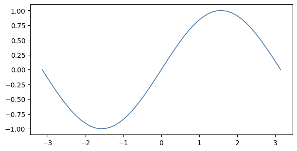
Lines#
The function numpy.linspace(...) creates evenly spaced points over an interval.
It is useful for plotting an equation, like the example below.
The same technique can plot any series of points.
For example, the points could be measurements from an experiment.
xs = np.linspace(-np.pi, np.pi)
ys = np.sin(xs)

with Figure() as (fig, ax):
    ax.plot(xs, ys)
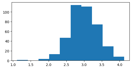
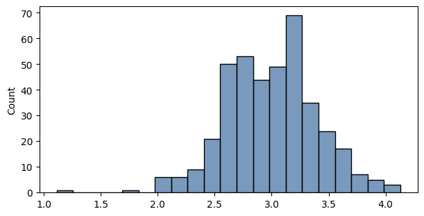
Histograms#
Both matplotlib and seaborn can plot histograms. The libraries have similar interfaces, and can generate bins and corresponding bars automatically. Note the libraries use different bin width algorithms by default. See their documentation to adjust bin widths.
xs = st.norm(3, 0.4).rvs(400)
maplotlib: example uses subplots directly.
fig, ax = plt.subplots(figsize=(6, 3))
ax.hist(xs)
plt.show(fig)
plt.close(fig)
seaborn: example uses Figure context manager instead.
with Figure(6, 3) as (fig, ax):
    sns.histplot(xs, ax=ax)
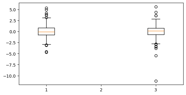
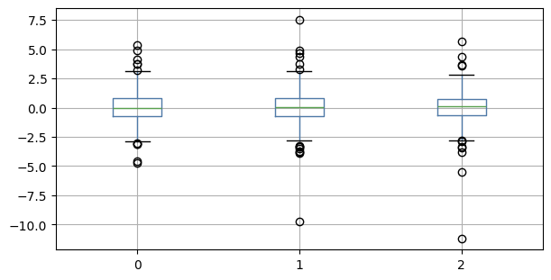
Box Plots#
The various libraries handle missing data differently:
matplotlib excludes a column if any element is nan,
seaborn and pandas exclude only the missing point.
To illustrate, the DataFrame below has np.nan at index (4, 1).
import pandas as pd
xs = pd.DataFrame(st.t(4).rvs([300, 3]))
xs.iloc[4, 1] = np.nan
matplotlib: note that the whole series at index 1 (value 2) is omitted
with Figure(6, 3) as (fig, ax):
    ax.boxplot(xs)
seaborn
with Figure(6, 3) as (fig, ax):
    sns.boxplot(xs, ax=ax)
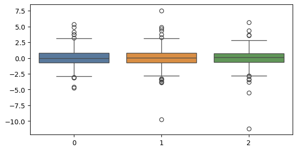
pandas: produces the same data points as seaborn with different default styling
with Figure(6, 3) as (fig, ax):
    xs.boxplot(ax=ax)
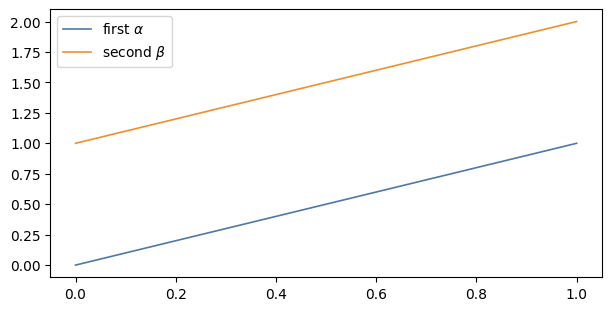
Legends#
Whenever a plot is labelled, or strings are passed to the legend function, matplotlib will create a legend. Simple LaTeX expression can be passed in the string.
xs = np.linspace(0, 1)

with Figure() as (fig, ax):
    ax.plot(xs, xs, label='first $\\alpha$')
    ax.plot(xs, xs+1, label='second $\\beta$')
    ax.legend()
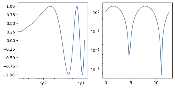
Scales#
Set the scale on an axis by calling set_xscale or set_yscale.
Read more about scales, including built-in scales, at Axis scales.
xs = np.linspace(0, 4*np.pi)
ys = np.sin(xs)

with Figure(n=2) as (fig, ax):
    ax[0].plot(xs, ys)
    ax[0].set_xscale('log')

    ax[1].plot(xs, ys+1)
    ax[1].set_yscale('log')
Others#
There are many other types of plots.
Matplotlib has a gallery of plot types here: Plot types.
Seaborn has a similar gallery here: Example gallery.
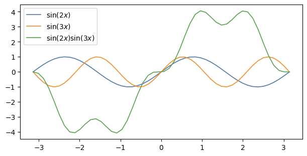
Combining Elements#
Elements on the same axes#
This example plots orthogonal sine functions on the same axis.
xs = np.linspace(-np.pi, np.pi)
ys_a = np.sin(xs*2)
ys_b = np.sin(xs*3)
ys_c = np.cumsum(ys_a * ys_b)

with Figure() as (fig, ax):
    ax.plot(xs, ys_a, label='$\\sin(2x)$')
    ax.plot(xs, ys_b, label='$\\sin(3x)$')
    ax.plot(xs, ys_c, label='$\\sin(2x)\\sin(3x)$')
    ax.legend()
    # ax.legend(['$\\sin(2x)$', '$\\sin(3x)$', '$\\sin(2x)\\sin(3x)$'])
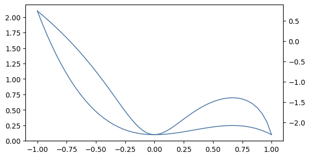
Multiple axes#
This example plots two functions with different scales overlayed on the same axis.
xs = np.linspace(-1, 1)
ys_a = xs**2 - xs**3 + 0.1
ys_b = np.log(ys_a)

with Figure() as (fig, ax):
    ax_left = ax
    ax_right = ax.twinx()

    ax_left.plot(xs, ys_a)
    ax_right.plot(xs, ys_b)
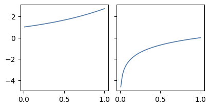
Multiple plots#
Plot multiple plots beside or above/below each other.
Use the argument sharex=True or sharey=True to align the axes’ ticks.
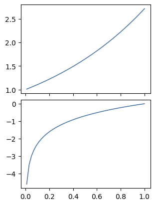
xs = np.linspace(0.01, 1)
ys_a = np.exp(xs)
ys_b = np.log(xs)

with Figure(4, 2, 1, 2, sharey=True) as (fig, ax):
    ax[0].plot(xs, ys_a)
    ax[1].plot(xs, ys_b)
xs = np.linspace(0.01, 1)
ys_a = np.exp(xs)
ys_b = np.log(xs)

with Figure(3, 4, 2, 1, sharex=True) as (fig, ax):
    ax[0].plot(xs, ys_a)
    ax[1].plot(xs, ys_b)
Styling#
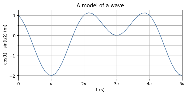
Titles, labels, ticks, limits and grids#
This example shows how to include:
a title using ax.set_title,
axis labels using ax.set_xlabel and ax.set_ylabel,
tick values and labels using ax.set_xticks and ax.set_xticklabels (and the corresponding functions for the y-axis),
grids using ax.grid, and
limits using ax.set_xlim and ax.set_ylim.
xs = np.linspace(0, 5*np.pi)
ys = np.cos(xs) - np.sin(xs/2)

with Figure() as (fig, ax):
    ax.plot(xs, ys)

    ax.set_title('A model of a wave')
    ax.set_xlabel('t (s)')
    ax.set_ylabel('cos(t) - sin(t/2) (m)')

    # LaTeX math in the labels here; escape the backslash
    ax.set_xticks([0, np.pi, 2*np.pi, 3*np.pi, 4*np.pi, 5*np.pi])
    ax.set_xticklabels(['0', '$\\pi$', '2$\\pi$', '3$\\pi$', '4$\\pi$', '5$\\pi$'])
    ax.grid(True, axis='x')

    ax.set_yticks([-2, -1, 0, 1])
    ax.set_yticks([-1.5, -0.5, 0.5], minor=True)
    ax.grid(True, which='both', axis='y')

    ax.set_xlim(0, 5*np.pi)
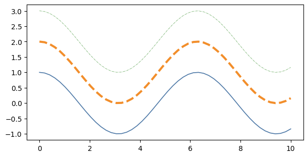
Lines#
Lines can be styled with width and stroke.
x = np.linspace(0, 10)
y1 = np.cos(x)
y2 = np.cos(x) + 1
y3 = np.cos(x) + 2

with Figure() as (fig, ax):
    ax.plot(x, y1, linewidth=1.2, linestyle='-')
    ax.plot(x, y2, linewidth=3.0, linestyle='--')
    ax.plot(x, y3, linewidth=0.5, linestyle='-.')
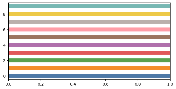
Colours#
In the Figure context manager, we redefine the standard colours to a palette that is similar to the matplotlib default.
The standard colour palette is what matplotlib calls a “cycler”.
There are ten colours, and the shortcut for each is CN where N is an index starting from 0.
Usually you don’t need to specify colour.
As you add plots to a set of axes, many plots in matplotlib will automatically cycle through these colours.
(axhline, which plots a horizontal line, does not cycle, so the colours are specified in order for illustration below.)
There are lots of colour options outside of the cyclers: Color.
with Figure() as (fig, ax):
    for i in range(10):
        ax.axhline(i, color=f'C{i}', linewidth=10)
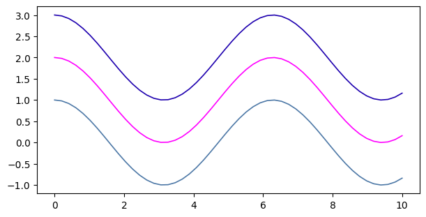
x = np.linspace(0, 10)
y1 = np.cos(x)
y2 = np.cos(x) + 1
y3 = np.cos(x) + 2

with Figure() as (fig, ax):
    ax.plot(x, y1, color='C0') # C1, C2, C3, ... the auto colour cycle
    ax.plot(x, y2, color='magenta')
    ax.plot(x, y3, color='#1E00AF') # RGB in hexadecimal (like in css)
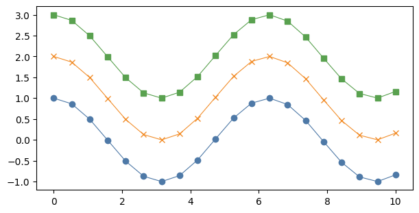
Markers#
Markers can be drawn at each data point. See matplotlib.markers for details.
x = np.linspace(0, 10, 20)
y1 = np.cos(x)
y2 = np.cos(x) + 1
y3 = np.cos(x) + 2

with Figure() as (fig, ax):
    ax.plot(x, y1, linewidth=0.8, marker='o')
    ax.plot(x, y2, linewidth=0.8, marker='x')
    ax.plot(x, y3, linewidth=0.8, marker='s')